Friday, December 14, 2012
Thursday, December 13, 2012
Dresser competition
(edited 2/4/13) - I made a mistake in the winning entries orders...its updated now.
Results for the dresser competition are out. I didn't get placed, but life moves on right? ahaha
So I would be lying if I said I'm not disappointed at all. I spent a lot of effort on this... but I won't even get to keep the dresser. You could say I've grown a bit attached to it. However, I also know that the winners spent just as much time and effort (maybe even more than I did) on theirs so I think everyone had an equal chance of winning. I definitely think the winners deserved the win.
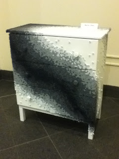
Here are some progress photos of mine.
Cream brulee latte is back for the holidays! Had to get some Starbucks for dinner...
The top and bottom are actually painted dark reddish brown, but it looks black in my photos. When I first heard that these drawers were to be auctioned off, my first idea was to aim for a practical design. Something that was simple but not too simple, something that should look good as a decor piece in any room. Turns out, the judges were looking for something radically different hahah
First of all, I have to apologize for the horrible quality pictures. It definitely doesn't do any justice to how great these pieces look in real life. If I get a chance, I will bring my real camera to shoot some pictures and re-post this. These are dressers designed by other students. I don't have everybody's name down so I'll just post pictures..
If im not mistaken, this was the first place winner. Painted with a very very nice shiny lacquer-like surface. The artist was smart about using Ikea products for it. The eyes also lights up.
This is third place winner if im not mistaken. Once again, picture doesn't do it justice. This one is pretty crazy!! The artist carved out all the silver lines and the white area is actually some sort of white plexi glass. The drawer includes this really hi-tech remote where you run your finger through and the entire drawer lights up and changes in color. You can kind of see it in the last picture. Very impressive.
This one was designed by a faculty member so it didn't count for the scholarship. It looks amazing in real life and really took the spotlight. I would totally buy it.
This one was made out of old ties!! Very creative! Looks even better in real life.
This one had some really beautiful details on the peacock's feathers. I thought the concept was very nice as well (using the dresser's knobs as eyes).
Second place winner made their dresser into a tree.
More 3d stuff
I'm almost done with the term...it's been a ridiculous two weeks and I'm happy to be able to get normal sleep again. This term was by far one of the most intense terms I've had (although im sure it will be worse in the future). I loved and enjoyed almost all of my classes, but I've been pretty disappointed in myself throughout the whole term. I felt like I wasn't able to do as well as I'd thought I would. I feel a bit hopeless when I look at industry standard work and realize how far behind I am. Art is definitely an endless journey of hard work, dedication, and new discoveries. I don't think anyone can ever reach the 'top' as it doesn't even exist. If there is anything I discovered within these two years, it is that I will never be good enough and I should never think I am. Well guess its time to keep climbing.
I'll be updating again later with other works, right now I'm still iffy about them so im not in the mood to post them up. For now, I'll post some of models I've been working on this term. I'm proud to say I no longer fear Maya (well for modeling and rendering anyways). I've definitely become a lot more comfortable with modeling although im still nowhere near great.
I've posted this one up before, but I re-rendered it using a new method which turned out a lot better. I'm not sure what happened to the shadow but oh well.
One of our project was to model something assigned by our instructor. .I was assigned to model a Hobart meat slicer. The annoying thing about this project was that almost every meat slicer was different (even though they are the same exact model number). For some pictures, due to angles, I could only see part of the pieces.
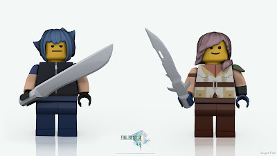
For our final assignment we had to design our own Lego figure. It must be something that hasn't been released by Lego yet. My original idea was to design a set of Disney's villain characters, but I really wanted to model some weapons so I went with Final Fantasy XIII (Noctis and Lightning). The hair was probably the biggest challenge...as well as the hole behind the lego's leg (which you cant see in these renders)
Based on this picture. (Lightning is the best female game character ever designed imo)
Subscribe to:
Comments (Atom)


